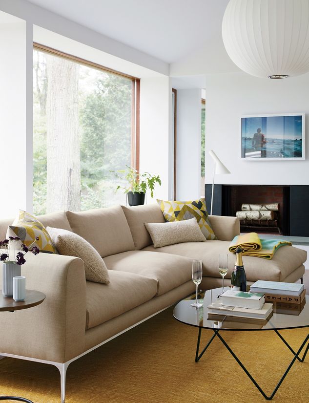
Jonas Sofa
Collection (2017)
Design Within
Reach, USA
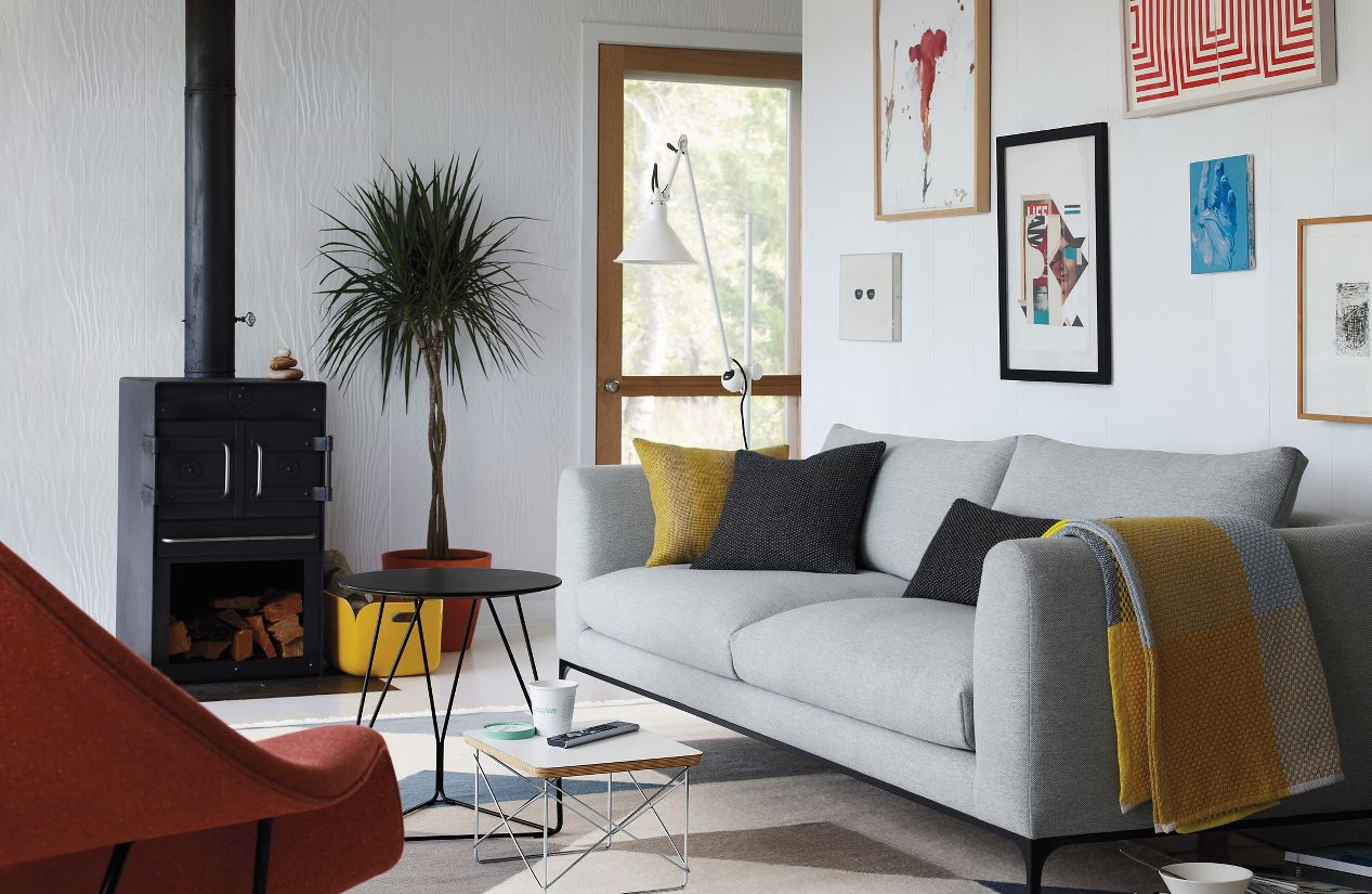
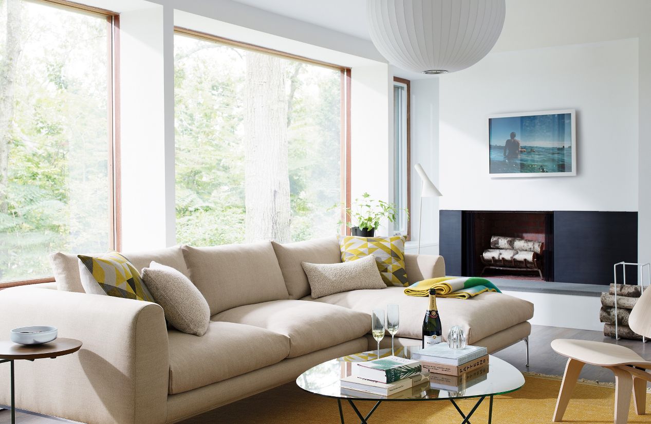
As the final project of 2016, we are proud to extend the collaboration with Design Within Reach with the studio’s most important project for the US market to date; the Jonas Sofa Collection. The seating range is the result of a close collaboration with the DWR product development team and craftsmen at the factory in Winnepeg, Canada. With a specific request for a multi-functional and versatile furniture range suitable for many users and living conditions the Jonas Collections is designed to become a social hub in the house for people to gather around. A sofa is the natural center-piece in a living room and I believe it should express confidence, quality and comfort, says Jonas Wagell, but it also has to be timeless and have a humble and unobtrusive expression to last for many years to come.
Jonas Collection includes four models and is available in four standard textile qualities and a total of 15 colours. The range is available in DWR stores in North America and online at www.dwr.com
Project information
Title: Jonas Sofa Collection
Object: Sofa range
Client: Design Within Reach
Materials: Plywood, steel, cast aluminium, feathers, micro fiber and fabric upholstery.
Design: Jonas Wagell
Year: 2016
Downloads
External product link
More work for Design Within Reach
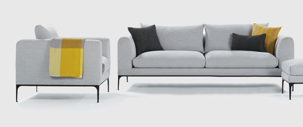
Having worked in the fields of graphic design and project management and studying in his native Sweden and the U.S., Jonas Wagell is a well-rounded designer and architect. His Mini House, a 160-square-foot prefab structure, earned him attention in 2008 as one of the world’s 50 hottest young architects. Working out of a studio in the Södermalm district of Stockholm (which Vogue called the coolest neighborhood in Europe), Wagell calls his approach “generous minimalism.”
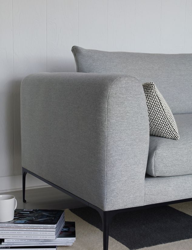
For the Jonas Collection (2016), he sought to create a piece that could be enjoyed every day – “a hub in the house that people would gather round to socialize and talk.” To encourage that, Wagell prudently specified cushions with feather fill and eased edges, arms with a gentle arc and legs slender and tall. “I try to create objects detached from immediate trends,” he says, “products that I can be proud of and that can be justified and appreciated for years to come.”
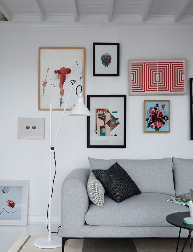
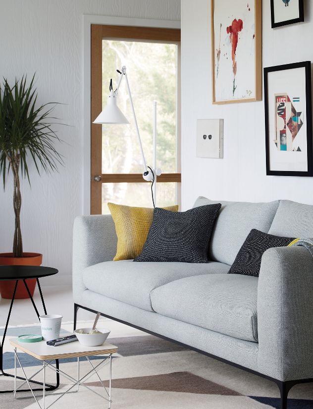
An interview with Jonas Wagell about work, design and the Jonas Sofa Collection.
By the editorial team at Design Within Reach,
New York City, September 2016.
What is your design process?
The work we do in the studio is old-fashioned in the sense that it’s really focused on form. I like to think good form and refined proportions always will be viable and vouches for timeless products and sustainable use. In fact, for some products form is more important than function, although I’d like to argue that the form is the function – the purpose – of some products. As long as an object hits a nerve with the user – creates feelings and emotions – it is justified and thus sustainable.
This approach is reflected in the work process in the studio. All projects start with sketching, research and problem solving to find a direction to a client brief or conceptual idea. This is followed by visuals and concept presentations. We are obviously depending on computers to a large extent to generate 3d models, visualizations and drawings, but the most important part of the process is to build mockups and models.
Paper, cardboard and tape and sometimes fabric, foam and wood is used to quickly construct several simple models so that we can compare and evaluate changes in details, form and proportions. To make changes, try alternative forms, evaluate and discuss why we feel something is better than something else is fundamental in the process. I always stress that technical drawings have to be developed in an efficient and rational manner, to allow as much time as possible for this crucial development process.
Depending on which type of project and its complexity, we sometimes also develop proper prototypes instead of 3d models as a reference for manufacture. The studio’s 3d printer is a valuable tool for smaller objects.
I’m fascinated by how a chunk of wood, some threads of yarn or a piece of plastic can take on a form that suddenly creates emotions and affections. Cutlery and tableware are good examples, where the materials are always the same but can become so much more with consideration to form and attention to detail.
How would you describe your work?
I want the products we create in the studio to be simplistic, intuitive and easy to understand. Perhaps this is related to my former studies and work with graphics and communication. I try to reduce unnecessary details and emphasize a function or main character, which often results in simple but expressive objects with friendly shapes and some distinct or emphasized detail.
During the eight years since the start of the studio I recognize a development of my work. I think the aesthetic today is more mature and confident, which may be a natural consequence of my own progress.
From “playfulness” to “cleverness”, as a journalist recently concluded. I think that’s a nice formulation.
However, it is also a response to the unsustainable development of the design business and a deliberate focus on and attempt to create timeless and long-term products.
What is your personal design philosophy?
The most frequent word I’m using about my work is probably “simplistic”. I use it with the intention to describe something that is simple and clear, but with a sense of refinement and quality. I have realized other designers understand the word better than consumers and therefore I will try elaborate on the meaning.
My interest in design started with graphics and communication. The clear and simple have always been a preference to me, since it promotes understanding, intuition and functionality. In my opinion, the purpose with simple form is not be scarce or stylized, but to enhance strong aesthetic expression.
When I studied architecture 15 years ago everyone was talking about minimalism, but I believe only a few truly grasped the full meaning of the word. Architecture and design with reduced, minimal form often becomes poor and weak, since it lacks character and personality. I believe in simplistic form that is reduced from clutter and unnecessary details with the purpose to uplift something else, such as a function or a beautiful form.
Which are your sources of inspiration?
For me as a designer inspiration comes with mood and mindset in a fairly abstract way. I visit several design fairs every year always to find myself feeling drained of energy after looking at all new stuff, rather than inspired. What is creating energy at these fairs are the encounters with people.
In a wider sense, inspiration comes when I have time for things I like – such as travel, culture, food and running. When I’m relaxed and happy I am at my most creative spirit.
What is your point-of-view on ‘design’?
The pace in which “designed” products are being produced and consumed promoted by trends and fashion is worrying. I try to create objects that are based on my own aesthetical expression detached from immediate trends – products that I can be proud of and which can be justified and appreciated for years to come.
For example, I’m really not interested in innovative materials or new technology, at least not in the visible sense. I like what it can provide for the usability of a product, but prefer to conceal it. In my opinion technology can create great functionality and provide solution for good design, but technical products almost always disappoint me aesthetically.
I try to design simplistic and clear objects reduced from clutter, but with some characteristic detail or expression. Giving a product that little something that challenges the aesthetic and create a sort of itch.
Working on the Jonas Sofa Collection for DWR, what was your objective with the design?
Creating a sofa that has originality and character, but also a timeless expression and supreme comfort is an exciting challenge. A sofa is a long-term investment for a home and should be made to last for decades, both in terms of comfort, quality and aesthetics. The sofa I have designed for Design Within Reach has a classic look, but we’ve added some contemporary features and reduced unnecessary details to achieve a clean aesthetic with comfortable and inviting expression. A sofa like this is all about proportions and attention to detail. The simplistic form requires the highest quality of materials and craftsmanship.
The slender metal legs have small feet which connect to the frame with in the shape of an arch – a form detail inspired by early modernist furniture and architecture –giving the design a sense of timelessness. The aim has really been to create a sofa that has a respectful relation to modernist classics, but with an expression that feels contemporary without being trendy.
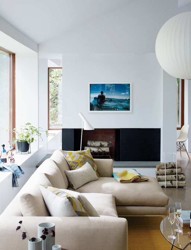
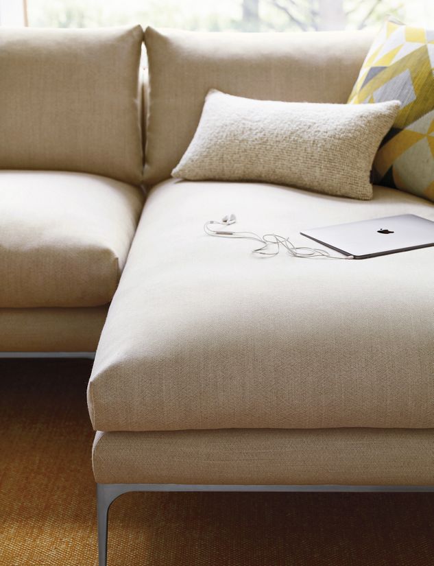
The range include a two-seat sofa, a sectional with chaise-lounge, an armchair and an ottoman. The simplistic and revealing form has required extensive work with refinement of details and proportions for all models to be in perfect balance and harmony.
How is the collection representative of your work as a designer?
I always strive to convey a clear and graphic expression to the objects I design, no matter if it’s cutlery or a sofa. It’s a minimalist approach per definition, but I’m really more concerned about achieving clarity and harmony. I avoid unnecessary details in order to communicate the essence of an object, such as a form or a function. In effect my work is simplistic and clear, and sometimes with clever or playful expression. Perhaps this approach is a trace of my Swedish roots.
Does it embody characteristics that are unique to your work?
We have aimed to create a sofa range which feels unique and original without having too pronounced details or characteristics. I believe giving form to a sofa requires more consideration and moderation than, let’s say, designing a candle holder. Smaller objects can afford to be more expressive and sometimes trendy, but in respect to a long lifespan we have tried to create a sofa which maintains a more timeless character.
Jonas Wagell Design & Architecture / JWDA
Swedish architect and designer Jonas Wagell is widely revered for his modern product and furniture design comprising soft, minimalist shapes with a welcoming expression. The Stockholm-based studio’s award-winning work combines graphic simplicity and playfulness to create pieces that typify modern-day life.
Words by Rachel Morgan for Audo Copenhagen
→ Read more about the studio!